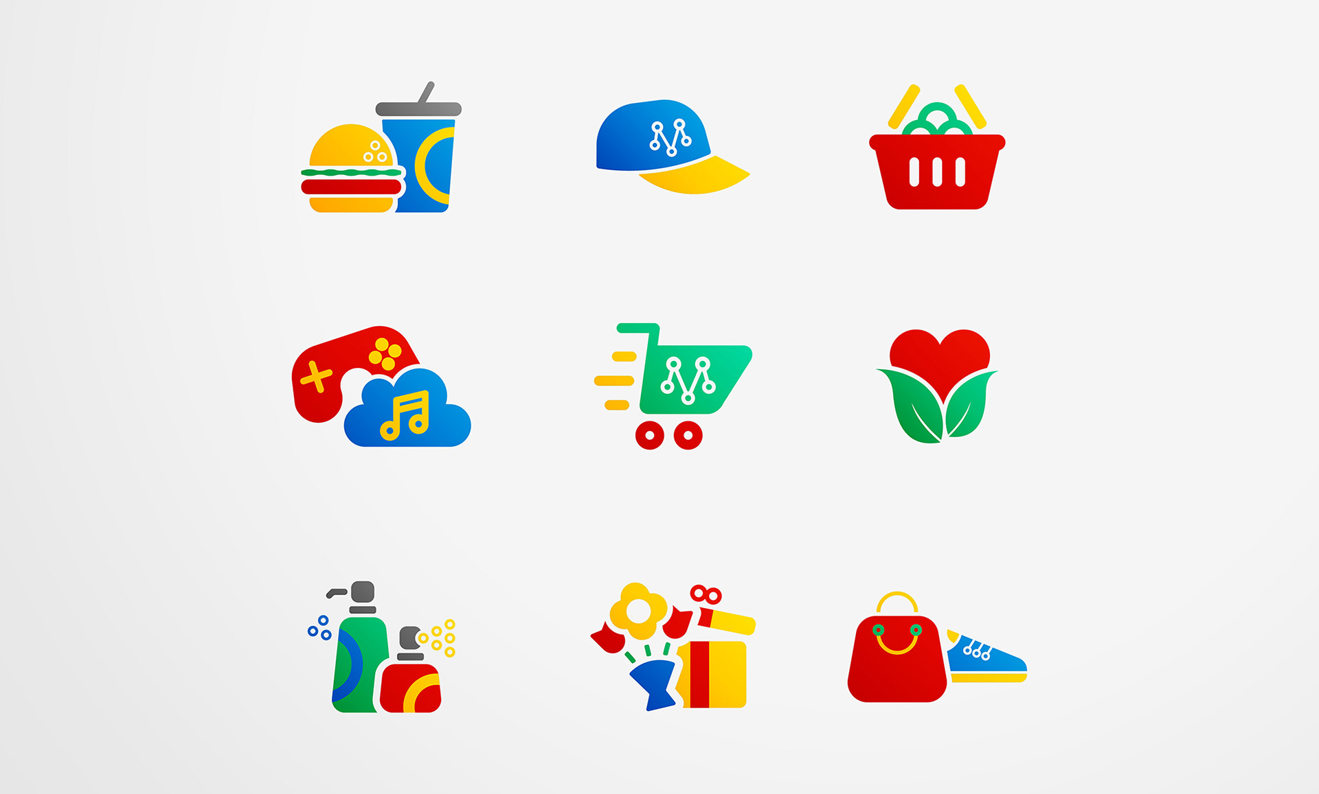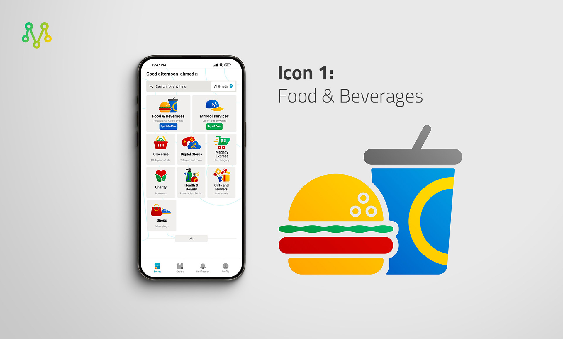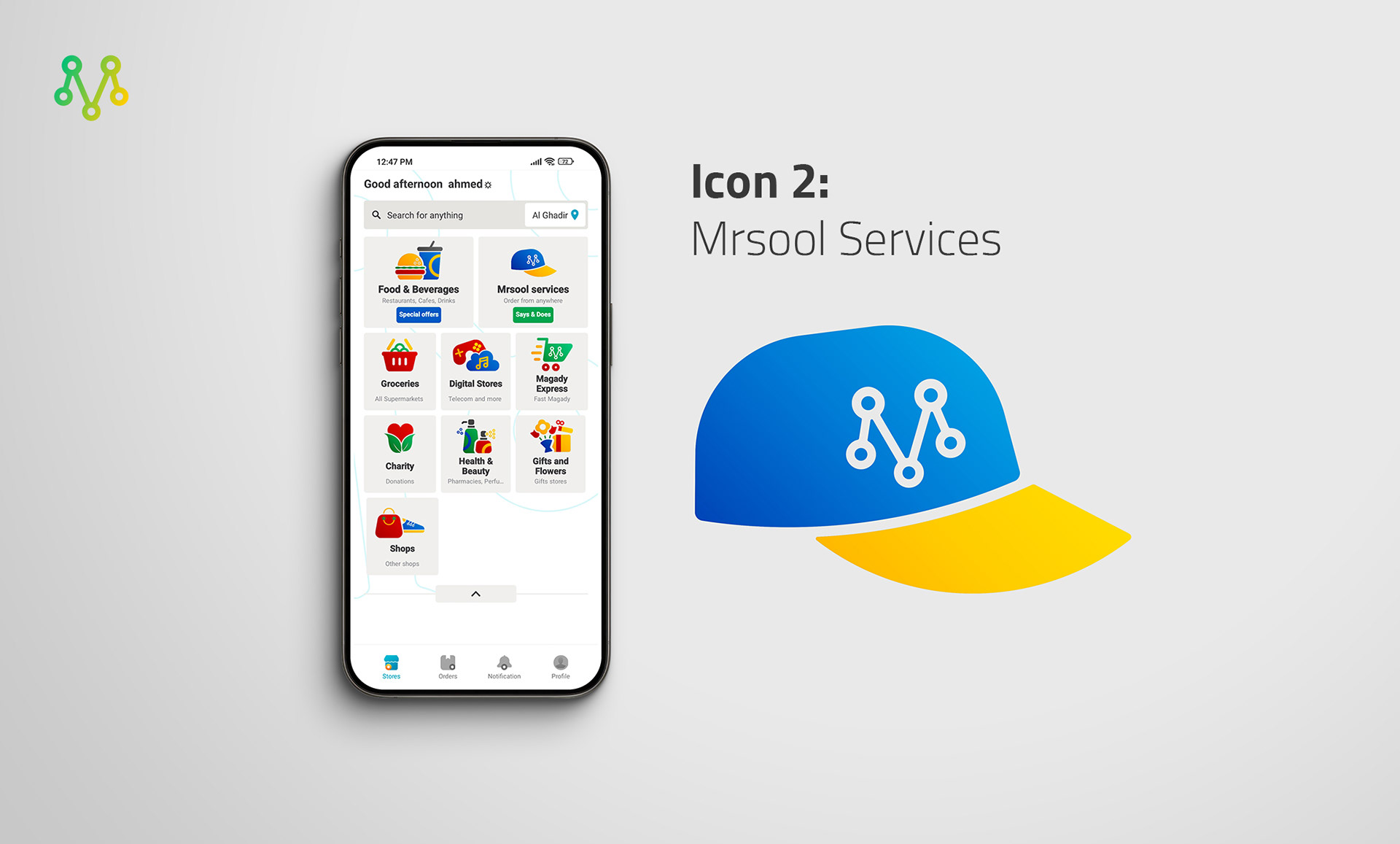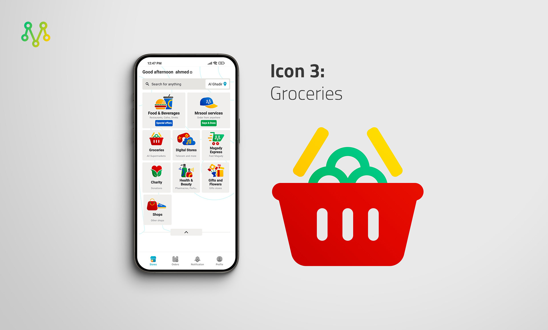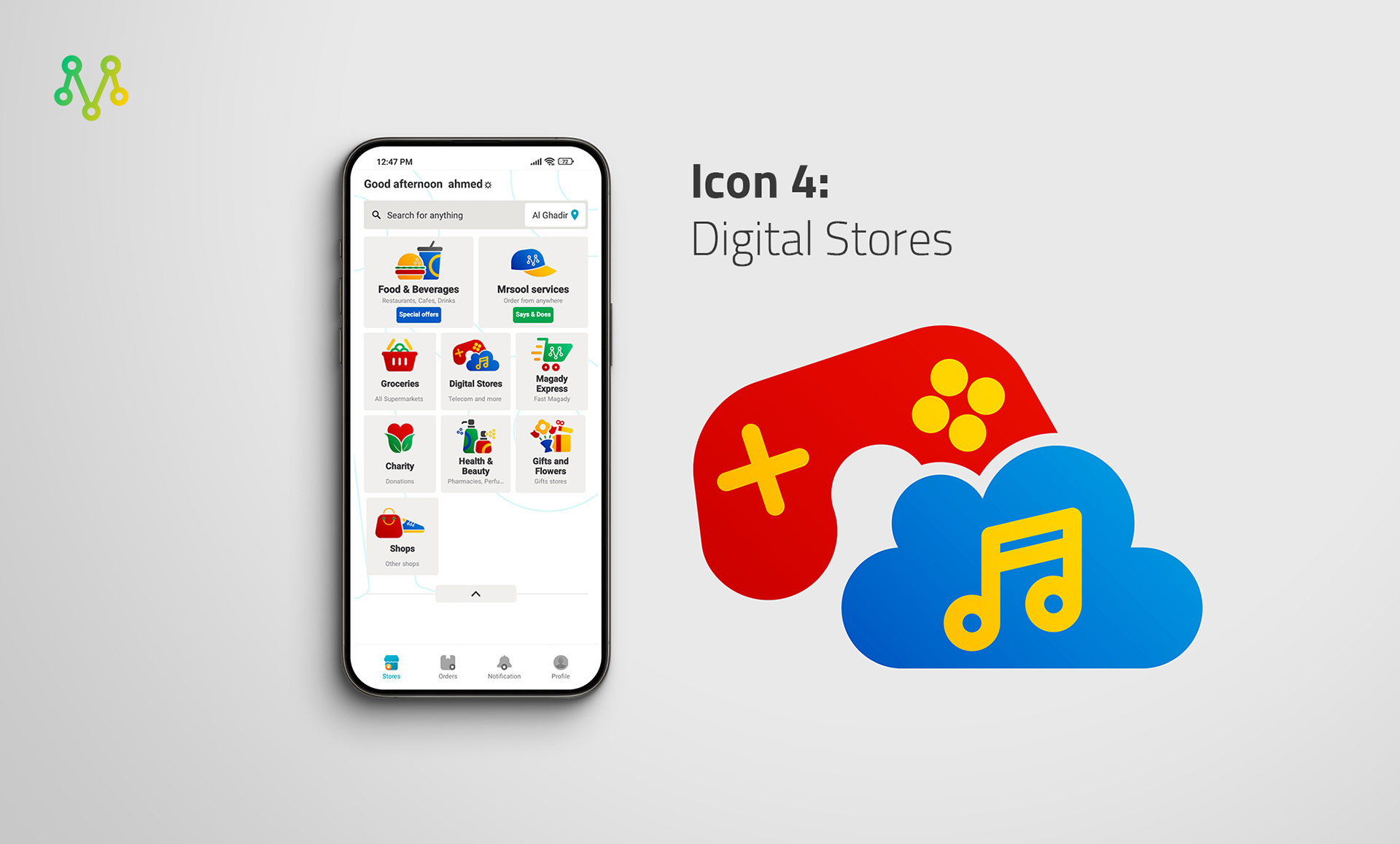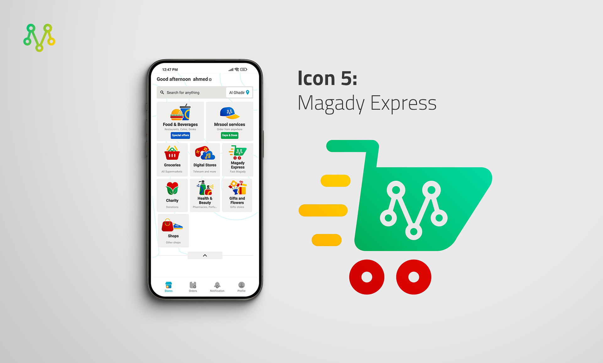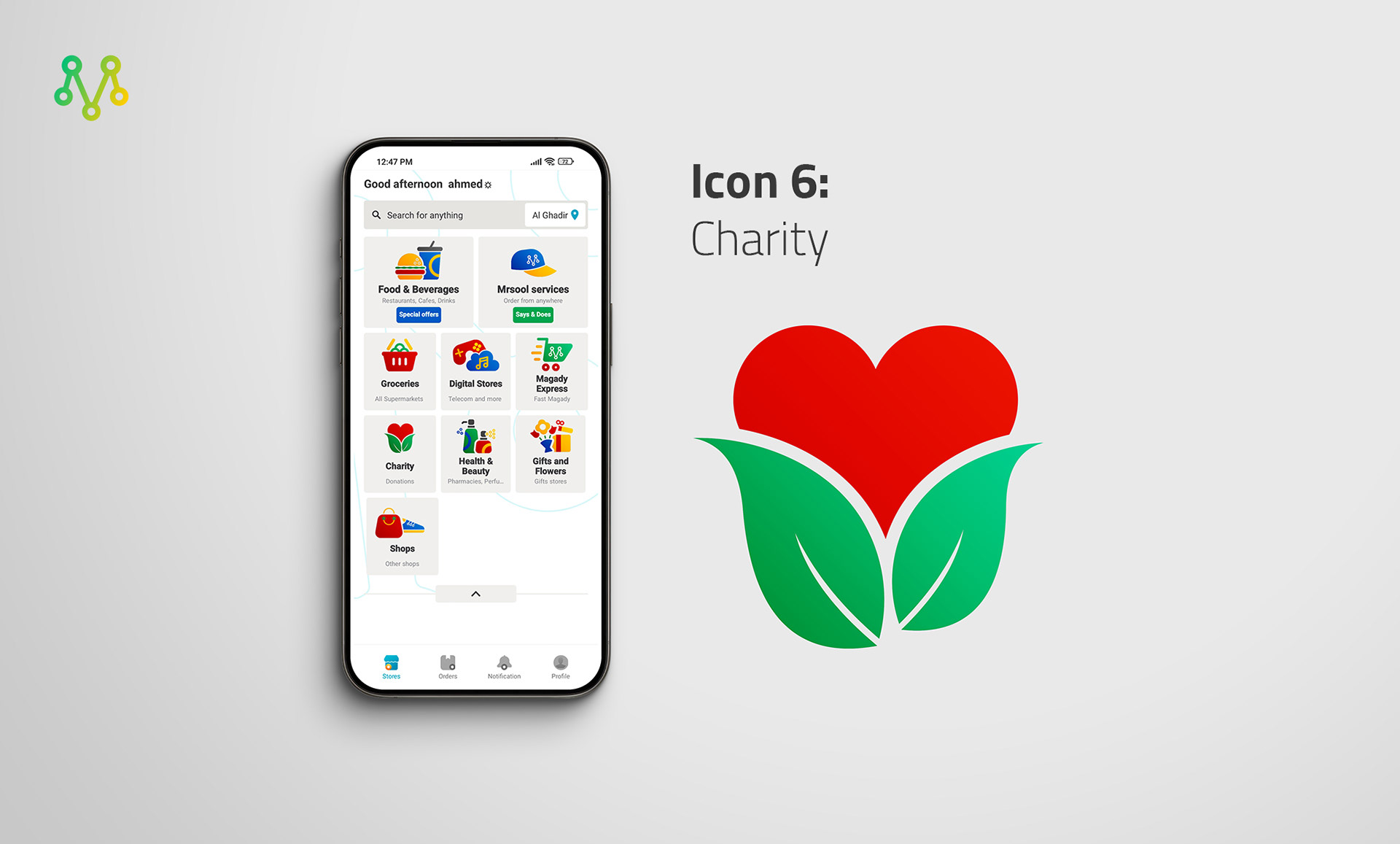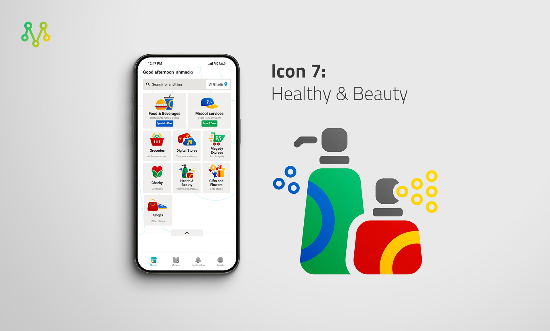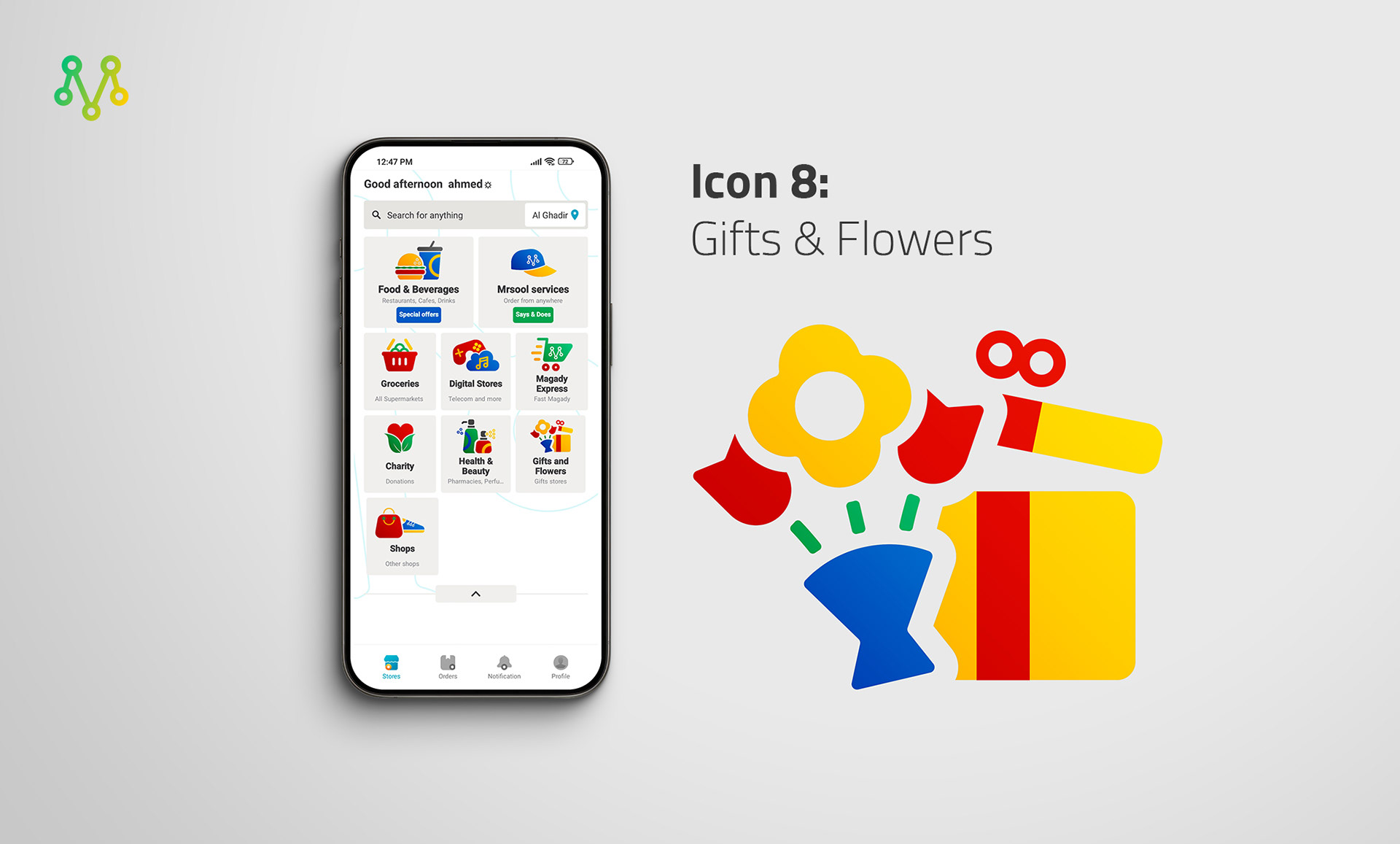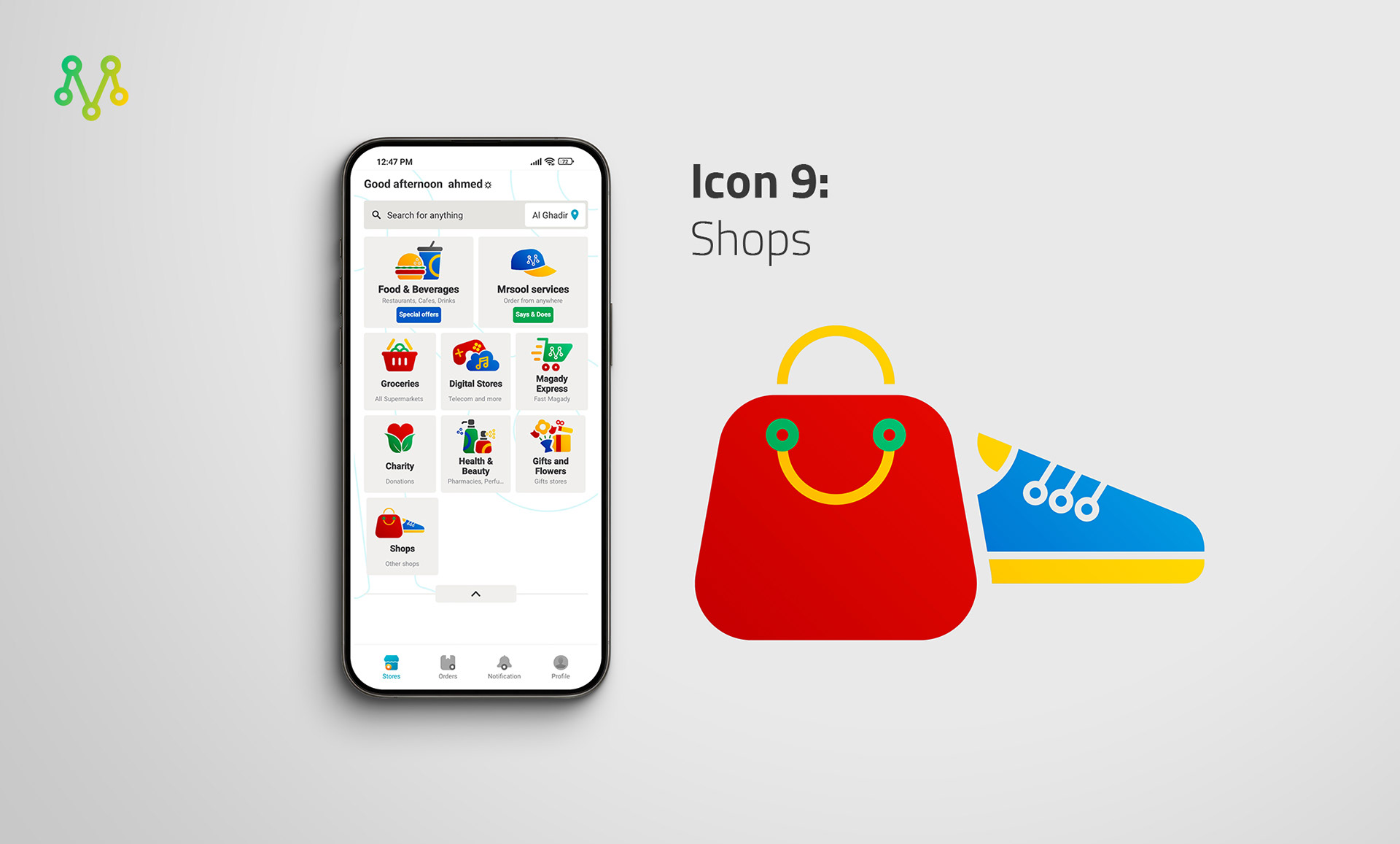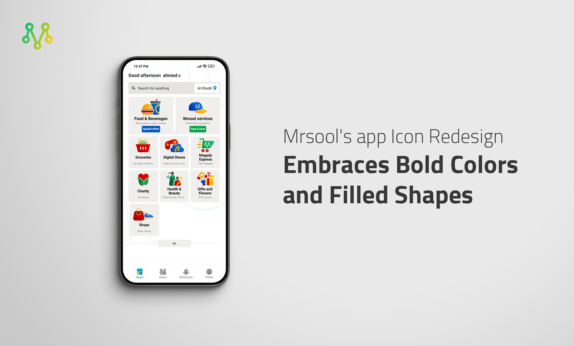
Mrsool's app icons were crafted to be both visually captivating and effortlessly understood. The circular shapes used in each icon reflect the main element of the Mrsool brand. Consistent use of the brand's color palette further strengthens the unified and cohesive feel.
The decision to employ filled icons stems from their enhanced visual impact on mobile screens. Additionally, the circular forms foster a sense of unity and consistency within the icon set.